If the world was flat, and Texas was the center, then, yes...I fell off the edge.
But since we modern people know it's spherical, I flew over the north pole (for real!) and landed safely in Hong Kong last week. I really underestimated the amount of effort it takes to get set up in another country. It's hard enough in the same town, same state, and same country.
Anyway, I've moved to this lovely island in Hong Kong. Here are a few pictures of my new commute home from work once I get off the ferry. I ride a bike! (No motorized vehicles in the back village.)
I have a "to-die-for" potential lampwork setup. But, it may be another month, or two, or three (I don't know yet) before I can really get going again. So much to do! Like obtain a couch for sitting. A bed for sleeping. Dishes for eating. Aiya! (Chinese for oh, my!)
In the meantime, I may be able to get to the promised series of articles on, "Appreciating the Art of Lampwork for Jewelry Designers" since that requires no tools or setup.
Let me catch up on my sleep first. :-D
Pages
▼
Wednesday, December 3, 2008
Sunday, November 16, 2008
Studio Time: A little something to look at
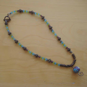
Sorry for the late post! I can't guarantee my reliability in the next month or so. But, check out these sweet little necklaces by my niece! She has paid attention to some of my design suggestions and she came up with these pieces completely on her own with some beads I gave her. So impressed with her!
Rose
Plum
And finally, I got a chance to play a bit myself. I'm smitten with Michal Silberberg's style--tons of color, intricate detail. She has some winter sales going on right now, so if you're fancying something new and different, check out her Etsy site. I absolutely love this green and blue piece.
And!!!
Introducing MoonKatty Studios...my friend who started this lampwork journey at the same time as me made these complementary beads. I had requested her to make some of her Cutie beads in my favorite colors and I adores me these beads. We were looking at my new treasures from Michal and these beads from MoonKatty landed next to each other and looked perfect together. So I wired them up simply on a figure eight chain. I can't wait until MoonKatty opens her shop so I can link out to her!
Saturday, November 8, 2008
Studio News: A Preview of Upcoming Posts
I needed to take a break this week, but I wanted to at least give you a preview of a series I'm working on. This will eventually be compiled into a single free tutorial for your use in marketing jewelry containing artisan glass beads.
Lampwork for the Jewelry Designer - Identify the characteristics of quality lamwpork beads and the multi-step process of how beads are made. The objective of this tutorial is to educate the jewelry designer on what to look for (and what to avoid) in glass beads. Understanding the time and investment the artist puts into the beads will help you, as the jewelry designer, market your jewelry containing artisan glass beads.
If you are a lampworker: what is your two-minute "elevator speech" you give to someone who knows nothing about glass beads?
If you are a jewelry designer: what is your two-minute "elevator speech" you give when explaining the value of the glass art beads in your designs?
Thanks, and have a great week!
Saturday, November 1, 2008
Creative Finds: Artful Blogging - the Next Installment
More raving about Artful Blogging (Autumn 2008) (Volume 2): After reading Emma's enthusiastic blog about Artful Blogging I started looking through my copy of this journal again. (Yes, I read her blog about my blog...) Then I stopped at the tagline: "Visually Inspiring Online Journals."
Visually Inspiring is the essence of what I want to achieve on this blog.
On to dissecting more reasons I choose printed magazines:
Regional or Local Flair: The majority of my marketing comes from in person contact. I find understanding my chosen home is essential to appealing to my audience. People usually want something that evokes a sense of where they are living or where they are visiting. For example, turquoise and silver are a staple of southwestern jewelry. I think in terms of Southwest-y-ness in colors I pick for my glass beads and also in terms of using turquoise stones in the jewelry. In magazines like Su Casa, SantaFean, Cowboys & Indians, and Texas Highways, I am able to gain additional insight into the textures, shapes, patterns, and colors of the locale. My home will soon be Hong Kong, so you might see a different flair. It might have a splash of the southwest ('cuz I really like the Southwest) along with an Asian twist. Hmm...that is really quite a combo - Texan and Asian. I am interested to see what my brain does with that...How this can help me: appeal to the local audience.
The story: My favorite art pieces in my home come with a story...how it was created, who is the artist, what the artist was thinking when they created it. I have picked up an occasional magazine highlighting artists in different media such as sculpture, painting, and photography. Since art is a highly personal and individual subject, the story is a way to create a connection between the minds. How does this help me: create a compelling story with my art pieces.
Learning Something New: I have been eyeing up the many craft and jewelry magazines out there. I can’t wait to get my hands on them. But…I’m trying to divest myself of the stuffage so I don’t have to lug it across the globe. I’m very into digital media these days. I look forward to when the Kindle: Amazon's Wireless Reading Device will be in color. How this can help me: provide useful information to my blog readers.
Small business gumption: (Gumption = I think I've been living in Texas too long.) I like to ruminate on the stories of small businesses run by creative individuals. How this can help me: Creativity and the business of selling beautiful things provide a catalyst to help me figure out how and where I can grow or not grow my business.
Inspire. Entertain. Inform.
Which magazines do you pick up? Why?
And a final note: Whew! That was a bit of pressure to finish a real article for this week. We’ll see if I can maintain this pace. I have a bunch o’ ideas for later, but need some courage (and time) to execute.
Credits:
First Photo: Su Casa, Spring 2005. Photograph by Jack Parsons. Inspired the use of wooden beads in the jewelry.
Second Photo: Pottery Barn, May 2008 Catalog, Page 57. Inspired the use of Dark Turquoise, Nile Green, and Pale Sky Blue in the jewelry. (This is a Version 2.0 of the necklace from last week's post.)
Third Photo: Pottery Barn, May 2008 Catalog, Page 37
Fourth Photo: Victoria, May/June 2008, Page 7, Laura Ashley advertisement. Inspired the hot pink and light pink dyed cultured pearls color combination.
Resources:
Artful Blogging (Summer 2008)Artful Blogging (Winter 2008) Single Issue (Vol. 2)Artful Blogging Subscription
Saturday, October 25, 2008
Creative Finds: Artful Blogging - The First Installment
I have been honored to be noticed and tagged by the following bloggers: Laura, Angie, and EVY Designs. I follow your blogs and enjoy your work very much! I have a confession to make...um...I am a "black hole" when it comes to forwards and tags. Forwards and tags fall into my email and never see the light of day again. I have been this way for as long as I have been on the internet--less one year...
Focus on Art
I recently picked up a printed magazine called, Artful Blogging. The main reason I selected it was for the gorgeous eye candy of other artists' work. This led me to think about why I pick up print magazines in general. The majority of my bead and jewelry inspiration come from...home decorating magazines. Weird fact: I do not care to read fashion magazines for inspiration.
So, I was thinking, what is it about home magazines that make me willing to part with my cash? If I can capture those key elements, then maybe I can improve my blog so it worthy of your readership. I started my blog as a "journal of jewelry lessons." Now that I am evolving jewelry from a hobby into a small business, I would like my blog to mature as well. I was reading Lori Greenberg's post on Write a Better Blog Post, which is a link to the in-depth article on Alyson's Art Marketing Action. The morsel I pulled out of Alyson's post: your blog content should Inspire, Entertain, Inform.
Seven Things that Inspire Me from Printed Magazines
Question to you: which printed magazines inspire you and why?
Focus on Art
I recently picked up a printed magazine called, Artful Blogging. The main reason I selected it was for the gorgeous eye candy of other artists' work. This led me to think about why I pick up print magazines in general. The majority of my bead and jewelry inspiration come from...home decorating magazines. Weird fact: I do not care to read fashion magazines for inspiration.
So, I was thinking, what is it about home magazines that make me willing to part with my cash? If I can capture those key elements, then maybe I can improve my blog so it worthy of your readership. I started my blog as a "journal of jewelry lessons." Now that I am evolving jewelry from a hobby into a small business, I would like my blog to mature as well. I was reading Lori Greenberg's post on Write a Better Blog Post, which is a link to the in-depth article on Alyson's Art Marketing Action. The morsel I pulled out of Alyson's post: your blog content should Inspire, Entertain, Inform.
Seven Things that Inspire Me from Printed Magazines
- Luminous photography. My all-time favorite magazine is Victoria. It's all about beautiful things. It went out of print for while and now is back. This magazine inspires prettiness. The main reason I choose certain magazines is for the photography. The element of the photography that sings to my creative conciousness is the lighting. The photography from Victoria in the 1990's was masterful in its use of light. The only way I can describe it is that it "glows." How does this help me? This inspires me to improve my photography and learn more about lighting.
- Color inspiration from floral arrangements. The floral arrangements in Victoria contain every imaginable color combination. I will purchase any magazine if it has loads of floral arrangements. I love to cut out these photos and paste them into my personal journal to soothe my storm of thoughts and release the creative flow. The color mixes range from subtle to astounding. How does this help me? There are some color combinations that would never occur to me, but seeing them in print gives me courage to try the unexpected.
- Color and pattern inspiration from home decor catalogs and magazines. I enjoy Pottery Barn for its slight inclination toward rustic. The 2008 catalogs have been capturing the photographic luminosity that seizes my imagination. Restoration Hardware portrays timeless elegance. Cottage Living, House Beautiful, Coastal Living, and Martha Stewart Living are another set of magazines, that, while not on my regular reading list, are part of my set of "treats" I distract myself with during travel. How does this help me? Patterns, styles, complexity, and simplicity stretch my mind toward various design sensibilities and enable me to appreciate and understand differing aesthetics.
Question to you: which printed magazines inspire you and why?
New This Week: Peacock Poppy Dots Necklace and Earrings
Tuesday, October 21, 2008
Studio Time: Peacock Poppydot Bead Set - Turquoise & Green
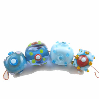
One of my early designs, revisited with greater precision. The dots are not precisely placed, but rather randomly placed. However, the dots on the dots are more precisely placed. Much better than my original attempts where dot placement was more haphazard. The colors are a retro turquoise, nile green, and light sky blue. Four beads are opaque and the three center beads are encased in clear with three different base colors.
Saturday, October 18, 2008
Studio Time: Esmeralda - the Necklace and Earrings
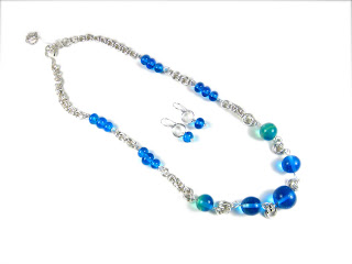
Another "poached" set from my bead store. I loved the Esmeralda set. Pictures never do glass beads justice because you don't catch the sparkle and twinkle you get in real life. The necklace is fairly demure so it can be worn as a daytime piece, but because it's glass and twinkly, it can be dressed up for the evening.
Available in my Etsy store.
Tuesday, October 14, 2008
Studio Time: British Cowgirl Earrings
Seems like an oxymoron? Right? Here's the story, the glass beads are from Laura Sparling, a UK lampwork artist. The twisted wire jump rings are handmade by me, in little ol' Texas. So, it's a collaboration of taste...
Saturday, October 11, 2008
Studio Time: Cotton Candy Bubble Necklace
Happy sigh...it's really fun to start with nothing but wire and rods of glass and end up with this. There is nothing purchased in this necklace except these base materials. The chain is coiled figure-eight chain, there are double-coiled eyepins, connectors, and my own lampwork beads.
I knew these colors were tickling my memory, but I couldn't figure out why. Then I showed a co-worker and she said, "Cotton Candy Bubbles." This design that is so un-"me"--it's a pink, girly, frothy confection of colors. But, it's fun to push boundaries and see where you go. And despite the fact that it's not me, I love it! Mixed in with the Bubbly part of the necklace are my first beads using Sarah Hornik's Think Pink! tutorial. I'm really happy with the designs. I didn't quite achieve Laura's precision, but I'm pretty happy with the result.
I've done a test-drive to check it for comfort and it wears nicely. This is my first time attempting these techniques. I used a lot of Sharilyn Millers wire wrap and chain ideas from her book, Bead on a Wire. I had intentions of finishing this into a clustered charm bracelet. But, this was 2 torch sessions, 20 lampwork beads, and reduced access to the torch. Instead, I played with wirework to finish this off. I've developed some alternative methods for the wire wrapping and want to perfect those for the next "real" necklace.
Saturday, October 4, 2008
Studio Time: Southwestern Sky Blue - the Necklace and Earrings
If you make your own lampwork and also make finished jewelry, have you ever been tempted to "poach" your bead store for your own jewelry? I have. I usually package up my finished bead sets and put them in a drawer for a while. So I don't see them everyday. Then, I'll go through them to remind myself of what I have and my brain starts going, "Ooh! That's pretty, that would look good as..." or "I could do xyz with this..."
This little set of Southwestern Sky Blue beads were begging to be made into jewelry. They were talking to me. "Make me into cute little western jewelry!" I've been trying to develop a western theme of jewelry (since I currently live in Texas) and have incorporated Southwest-y colors (baby blue, turquoise, and candy apple red) in the lampwork beads. The necklace is in a classic design with a western twist - handmade (by me!) twisted jump rings in copper and silver, finished off with leather cord. The earrings complement the set with morning glory lampwork design and more twisted jump rings.
Sunday, September 28, 2008
Creative Finds: Sarah Hornik's Think Pink!
For all your lampworkers out there, Sarah Hornik's Think Pink! IS A MUST HAVE!!! I can't believe she only charged $20 for all that info! It's sooooo good. Jam-packed with information on working in reactives.
The above is my favorite bead of the bunch I tried out. I haven't had much torch time lately, but one of my friends who took the original beginners class with me has been letting me get some torch time. I feel like I'm starting over. (Sort of...I've been re-photographing my original beads to re-post to this blog since the originals were lost...and I really have come a long way since the beginning.) I made more beads, but this is my favorite, paired with some CiM colors. I'd like make a bunch more and make a bracelet out of these colors of beads. It would make a pretty little charm bracelet.
As for working in reactives: Sarah has made learning reactives really easy. I can't believe I did such a cool bead! I've been afraid of reactives - they're more expensive and the stuff I've done so far...eh. It's all right. I just figured I needed more experience. Sarah took care of that. Just work with the glass. A few of my early attempts did get good reviews...but I would feel guilty letting the glass do all that work while all I did was make a round bead with dots. Now I know...that's just the beginning...let the reactives roll!
Saturday, September 20, 2008
Studio Time: Oceanic
Thought I would publish a little more to look at. This is a necklace and earrings I did in June combining chain maille from Urban Maille and beautifully gorgeous colors from Creation is Messy. It's mostly Sapphire and a little bit of Peacock Green to get a Carribbean look. I will take some time to rave about CiM colors in another post. If you've been thinking about trying them out...you MUST. They are yummy.
P.S. - I was trying out Wordpress because some of the features were more user friendly. Blogpsot has improved since I left and now I'm back on Blogspot. I copied my posts from the Wordpress blog back here. The older posts are sans pictures (for now).
In fact, this necklace is actually published on the Sapphire page.
P.S. - I was trying out Wordpress because some of the features were more user friendly. Blogpsot has improved since I left and now I'm back on Blogspot. I copied my posts from the Wordpress blog back here. The older posts are sans pictures (for now).
Friday, August 29, 2008
Creative Finds: Taking a Moment to Rave
I’m usually not one to camp out at my mailbox. In fact, I try to avoid it as much as possible. I mean, the only thing I get is bills. But…I was camping out on my mailbox. Ever since Laura started posting her study in reactives after she bought the Sarah Hornik tutorial on Think Pink, I’ve been going ga-ga over Laura’s twist on reactives. I’m not sure what caused that reaction…maybe because I’ve packed up my own studio for the time being and must live vicariously through other artists, maybe because I’ve seen all these other artists playing around with Sarah’s tutorial, maybe because it’s so cool to see the influence / collaboration of two artists who produce my favorite work at the moment. I dunno. Maybe all three. But, I’m the proud owner of the EDP Sampler Set. I’ve been camping out on my mailbox every day, wondering how long the post takes from UK to Texas. My little presents got here yesterday. And the above is what I did with them…
Here is what I must rave about…if you look at these beads from the side, look at that gorgeous detail around the bead holes! I don’t want to hide that. I also have the Rainbow Cogs from Laura that I’m trying to figure out how to display these gorgeous designs from the side. I think these beads with these designs around the bead holes would make great rings. I have some ideas in my head, but that requires some metalsmithing and other metal skills that I don’t currently possess. Oh, and the icing on the cake? Laura has managed this fine, intricate detail into only 9mm x 12mm! If you think the precision is jaw-dropping looking at your computer screen, wait until you hold these exquisite, delicate beads in your hands and think of the control it takes to get that fine detail in such a small space.
Finally, I put the yellow beads into the above earrings and strung the green beads into the necklace below so I could wear it today. I’m planning for this stringing to be temporary. I have a design in mind that will allow those green beads to stand out. In the meantime, I’m trying out different colors to see which one I’m going to stick with to accentuate the green beads. The high contrast of bead colors, as exemplified in the necklace below, is a signature design for me. Laura mentioned her design challenge is to be organic. Mine is to be monochromatic. I mean, I’m the type of person where white should only be an accent color. I lived in a white apartment for 2 years when I moved to Texas. My last two houses have been the antithesis of white walls. In fact, I was trying to think of any white walls I have in my current house. Only in my closets. Every wall in my house is saturated with color. Everything I wear has color. I also only wear white as an accent. But, I have narrowed the accent beads for the final design to green to accentuate the prettiness of the Psychedelic Peacock beads. Now I just have to narrow the greens down…I still want to try different greens…augh!
I think I will “need” to do a second temporary design to try out the different greens.
Friday, June 27, 2008
Studio Time: More Eye Candy
So, since jewelry is still a spare time hobby, I’m not going to be posting frequently. I haven’t posted the last few weeks because I’ve had a number of custom orders to finish up. However, I’m back working on regular things for sale. Still small quantity and varying designs…I’m still open for suggestions about what you would like to see!
For sheer eye candy, check out the latest Advanced Weave from Urban Maille. I love that Aislyn designed this with copper rings. This is a good way to learn a trickier weave. I also did the expansion pack of the Serpentine necklace in copper and silver with three twists…it’s really eye-catching. I’ll post that when I get a picture.
Tuesday, June 10, 2008
Friday, May 30, 2008
Studio Time: Byzantine Chain Maille Watch
Chain Maille! I’ve been making some of my own jump rings, which naturally leads to reading more about how to make better rings and what you can do with jump rings. Chain maille! Hundreds of tiny jump rings woven into various patterns. I did not make these rings, although I did assemble the watch band from a fantastic kit that teaches the chain maille weaves from Urban Maille Chainworks. Talk about an easy way to learn the Chain Maille weave! Aislyn has done all this work to create a kit with all the right-sized jump rings cut by her husband. She includes a tutorial that teaches this specific weave based on the Byzantine pattern.
This particular watch is Argentium Silver which is highly tarnish resistant…a definite plus!
So, in addition to lampwork, beading, and wire-wrapping, I now offer chain maille potential in my jewelry.
This particular watch is Argentium Silver which is highly tarnish resistant…a definite plus!
So, in addition to lampwork, beading, and wire-wrapping, I now offer chain maille potential in my jewelry.
Tuesday, May 27, 2008
Studio Time: Esmeralda
Esmeralda…beautiful green gems that seem like they belong to an Arabian princess. This lovely set is courtesy of an online tutoring session from Laura of Beads by Laura. (Thank you, Laura!)
Monday, May 26, 2008
Studio Time: Giddyup! Western Necklace and Earrings Set with Twisted Wire
I thought I’d try some twisted wirework. I want to expand my repertoire of jewelry skills beyond simple beading, so I’m trying to expand in the wire work. I really like the look of the twisted wire. I messed up the first couple of tries, but if you twist slow enough, it turns out great. The earrings are my favorite. I love the necklace, too, because it’s nice and jangly.
Thursday, May 22, 2008
Studio Time: New Earrings and Bracelet - Lady Olivia
Thought I’d take a break from my funky jewelry and do something more neutral and basic. It looks antique-y and old, but it’s brand new with my lampwork beads and antiqued brass. I don’t know what to name it though? Help? You can win some earrings or beads for helping me name them. ;-D
Updated: Rachel E won the earrings…these are now named Lady Olivia. Thank you!
Thursday, May 8, 2008
Studio Time: New Styles and stuff
In spite of the silence, I've been busy. I'm working on my first wedding commission...
A custom order for earrings:
I did my first hollow beads tonight
And I'm working on a design for connector lampwork beads. The connector beads are still pretty rough. My very first one was actually good...and true to my usual form, the next 10 have been bad. However, I still think they will work in jewelry when you put in silver spacers or Swarovkis - kind of hide the rough edges.
Oh, and here is an alternate design, inspired by the wedding commission.
Sunday, April 6, 2008
Artfully Meandering: Suffering from the Creative Storm Again
Okay. So, I really like the impressionist trees in the last post. I want to develop this style. I like to sketch ideas first before I do them in glass. Especially when my mind is rather blank as to where to go. The trees were kind of a happy experiment, but I have a lot of experiments that fail. (Like the gingham bead I was trying out. UGLY!) I can go off in some design directions, but I need some things rattling in my brain first.
SO. Here come the colored pencils. Bought some Crayola colored pencils to try out some impressionist ideas...and swirled off into this creative storm. Crayola was rather short on the purples and blues I wanted to work in, so I got some Prismacolor pencils. And let me tell you, once you go Prismacolor, you will want to banish your Crayola's forever. I spent yesterday playing with colored pencils (while fighting with a migraine...yippee). Then I found myself looking at the Prismacolor boxed set. HOLD UP! I still have glass I need to play with. Must focus. Must focus. But, I can go hurtling off into space on any given tangent. Jewelry and glass should be sufficient. Sigh.
I also started crocheting lace belts and scarves while watching TV. But, that's just a sideline. My wrists can't take that for very long.
Wednesday, April 2, 2008
Studio Time: The Best of My Imperfections
While I would like to master precision, I like organic, objects with character. Actually, I’ve found I like impressionist type art. I did a base barrel of blue, a thin encasing, then a layer of grass and clouds, then more encasing. I squeezed slighty so it’s a chubby squeeze bead. I then decorated the tree in budding leaves and left little trails of flowers in the grass. The first one turned really well.
This one cracked and I'm a little happy with that fact because I'm keeping it. I love the way the tree trunk turned out on the side of the bead.
Friday, March 21, 2008
Studio Time: Dots Aren't a Saga Any More
Wednesday, March 19, 2008
Studio Time: My new beads
Finally - getting around to posting the new beads. Here is the first of the sets called Southwest Sky Blue featuring Morning Glories, Fiesta, Mod Dots, and a Martian Focal Bead.
I'm working with my Creation Station and it works BEAUTIFULLY! I'm able to place dots with a lot more precision on a consistent basis.
So, just to note the current styles I'm able to do well:
- Peacock Poppy Dots - layers of three dots in a peacock pattern
- Mod Dots - layers of two dots in a centered pattern
- Fiesta - scrolled stringer with dots
- Morning Glories - florals with outwardly raked petals
- Scribblers - random stringer work
- Cherry Blossom - four-petal florals
New styles I tried tonight that worked:
- Martian Beads - it's the chubby focal in the Southwest Sky Blue set. I'm not quite sure if I'm sticking with this name, but that's what popped into my head when I was looking at it. I've been going with the names that pop into my head, even if they don't really make a lot of sense.
- Chubby Paisleys - this is a new style I tried out that turned out fairly well
- I've been doing a lot of dot patterns and don't know what to name some of them
New styles in development:
- Polka Bubbles - I've been trying these beads but haven't had the precision. With the Creation Station I think I'll be able to get some more precision.
- Argyles - I've been playing with this style for a while. I need some precision with placing large dots. I have one that I think almost turned out tonight. It has a lot of contrasts and the melting distortion makes me think of Argyle socks. The previous attempts were still a little wonky, so those are part of my niece's collection. I'm not sure about tonight's bead. It may be another bead for my niece. We'll see.
Since I'm getting some consistency in style, I might be able to take orders for color combinations. I don't know. I'm mulling this over. What do you think? I don't know how I would post that on Etsy, though...
Saturday, March 8, 2008
Studio Time: First Real Session in Two Months!
Sighhh.....as, in a good sigh. This is the first REAL torch session I've done in two months. TWO months. I set up my Creation Station and 20-lb MAPP gas tank. I had been using the 1-lb tanks and would have to stop and take breaks. Oooh, I love the 20-lb tank...continuous torching!
Right before I left on a business trip in January, I had just developed a decent technique with encasing and doing a Morning glory floral on top. So, based on the results of tonight's session, I think I'm going to narrow my focus and develop new techniques slowly...The Morning Glory beads are going to be a new staple. These are my first good precision beads. And since mod dots are still in fashion, I'm going to continue doing different color Peacock Poppy Dots style. I'm also going to go back to focusing on a color set. I have a bunch of beads that are similar, but not really part of a set. I like sets.
I experimented for a while at the beginning of my session. I'm bad about peeking...also my experiments made me say, "eh..." But, the above two styles make me tingle. I think these beads are worthy. I feel good about the base style of beads I have to offer now and I'll build on those. It's funny - I can't seem to do stringer very well. I started off well with stringer decorations and was horrible with dots. So, I focused on dots, am getting some decent precision with them, but now I'm terrible with stringer. I'm hoping the Creation Station will help me out with that because it helps me hold my hand steadier.
I'm not sure if I'm going to try to make sets of the beads I have or just post them as assorted...haven't made up my mind yet.
Friday, January 4, 2008
Studio Time: Encasing is where it's at in glass
Okay, okay, I'm coming around to the fact that the reason you do glass involves encasing. I've been pretty scared of encasing, but I'm beginning to come around. My first attempts were really messy. I'll use the messy encasing in my designs someday, but right now, I just need precision.
I did three encased beads tonight. I'm REALLY excited about one. I had sketched it out and it turned out exactly like I imagined. Actually, even better than I imagined because it's glass and all sparkly. But, then I ruined it with the stringer work. I need to do straight stringers to make a diamond pattern. A few are straight and a few are shaky. If I would have just done dots, this would have been a great bead. In spite of the shaky stringers, I still really like it. It should be a keeper for me.
My other disappointment is I wanted to do blue transparent colors with black stringer scrolls and then etch them. I did Dark Streaky Sapphire. This is phenomally beautiful color. But, the stringer work didn't show up. The Sapphire was too dark. And then I etched and it took the pretty out of the beads. So, lesson learned: Sapphire should be for layering in with other blues. It's too dark to be by itself except as spacer (which did turn out really cute). I'm going to try an acqua blue with black stringer and turquoise with black stringer. I think I'll try etching a few of the turquoise. I also want to play with the presses. And encasing! And I'm going to implode!
Focus. Focus. Tomorrow, it's the blues with black stringer. And see if I can repeat that focal bead but WITHOUT the stringer work. I'll keep stringer work separate until I have real control instead of random control.