Sunday, September 22, 2013

Kanna Inspire: The New Name

Congratulations, Amy Cavaness for suggesting the name that led me to choosing Kanna Inspire! Amy suggested Kanna Be Inspired, which I mulled over and shortened to Kanna Inspire. I like it from multiple angles. Amy, thank you so much for your ideas!


Also, I compiled a list of all of the suggestions. Blue Lapis and Gaga4Graphix suggested the 31st and 24th ideas. Your prizes are as follows:


Please email me to claim your prizes!

Saturday, September 21, 2013

Kanna Inspire: The new name for the e-zine will be announced

I had a little bit of a delay in announcing the new name of the magazine. I traveled for work this week and I forgot how draining work travel can be, even if it's relatively local and not across the world.

Most of the time I work from home (really, I'm appreciative of this opportunity), and most of the time these two creatures are my "co-workers." They are super cute in their work drawers.

I'm compiling the drawing for the winner and will post on Monday. Thanks so much for checking in!


Sunday, September 8, 2013

Kanna Inspire: What's the big deal about inspiration?


As I was thinking about what people might be googling that could cause them to stumble across this e-zine, these are the key questions that really got me thinking:

  • How do I define and/or create my art style?
  • How do I improve my style?
  • How do I transition my style?
  • How do I improve my art?
When I googled these ideas, I cam across a wealth of blog posts with standard ideas like practice, practice, practice. There were great blog posts and I will share the best posts in a future article. 

But that led me to thinking about why I think inspiration challenges are an important part of our journey to defining and improving our art. 

My Story

I started my creative journey in 2007. A quick scan through my year 2008 posts will show you the key points of my journey in glass and experimentation in a number of different jewelry techniques such as stringing, wire-wrapping, and chain maille. My initial style was quite colorful and crazy (and got lots of feedback). My emerging style started settling down.


In 2009 when I was able to focus on my jewelry business, I started creating themes for each monthly newsletter and designing my jewelry to go with the theme. I ended up being very surprised with the result of fencing in my creativity and designing around a theme. In stead of confining and restraining my creativity, I actually focused and thereby stretched, refined, and honed my skills and artistic style. I came out of these themes with a defined artistic style and jewelry collections.

Your turn: what about you? What was your journey to defining your artistic style?

Thursday, September 5, 2013

Kanna Inspire: A Naming Contest


I have a little wrinkle in the launch of my new e-zine. I originally started this process last November / December. I think I googled the name Inspiration Adventures and had not found anyone that had staked a claim to the name. During the delay in launching the first issue, the domain name was obtained up by a photographer who just launched a blog this June. 

I decided to look at this as a great opportunity to come up with a smashing new name for the zine. So I am holding a naming contest. 


The Prizes

I am currently working on a prize. Part of it will be a print copy of the first issue of Inspiration Adventures  (soon to be re-named). I am working out the details of the other parts of the prize and will update the post when I know more. 

Updated prize package:


Oh, yes! These are definitely books you want in your art library!


Two Winners

There will be two winners
  • Everyone who suggests a name will be put into a drawing for a prize package for each name suggested
  • The person who suggests the winning name will also receive a prize package
If I have a hard time choosing the name, I will put my final choices out for a vote. 


My brainstorms so far

I have been brainstorming on my own, but none of what I am starting with has been resonating with me. I'll throw out some of the ideas I have below to hopefully spark some fab names from you. I have been learning Mandarin Chinese for 10 years. My studio name, Kanna, is from the term Look! 
  • "Jili" is one I am playing with. It's not quite the definition of inspire that I wanted - this one means encourage and motivate. The other word "guwu" didn't look as comfortable in English. The other issue with Jili is that if you say it with the wrong tone, you could mean something very different.
  • I ran a newsletter for a few months called The Kanna Spark
  • I've been playing around with Art Inspiration or Art Inspired
  • My brain works like fireworks when I have ideas going on
So, can you help me out? Thank you so much in advance!

Studio News: The Winner

The winner of the latest giveaway is Linda Barutha!

Tuesday, August 27, 2013

Kanna Inspire: Amy Cavaness and another giveaway


I have more goodies for you today! Stay tuned to the end of this post.


First, I wanted to spotlight one of the first issue's contributors, Amy Cavaness. She makes gorgeous art quilts and you can find out more about her at her website, Amy Cavaness Designs


How did you get started in your art?

I got started sewing in Home Ec in 8th grade, though my mother and grandmother sewed dresses for me. I came from very creative stock!

How long have you been creating?

I've been creating since I learned to sew--I've pretty much always had a sewing project going. I've subscribed to sewing magazines since my early 20's and have made extensive use of the internet to keep up on new products and techniques related to sewing and quality arts.

Tell me three things about you:

  • In addition to my four sons and four dogs, I've "adopted" about 10 people over the years, living with me from periods of weeks to years. Making up for being an only child, I guess!
  • I have a Master's Degree in Piano Performance and Pedagogy from Northwestern University. And I don't own a piano. (Oh, the things we do for our mothers!)
  • Favorite hobbies are dancing and trail riding. LOVE working with my horse using Natural Horsemanship techniques (horse whisperer stuff). Some people call me a dog whisperer, too.

What appealed to you about participating in Inspiration Adventures?

I wanted to participate in Inspiration Adventures because I love color and I love challenges. I really want to do another one and do a new piece of art!


Now for this week's giveaway:

Please start sharing the love and letting other people know about Inspiration Adventures! 

An idea for a quick link to share: 
New art e-zine featuring 8 artists and one theme. Free trial issue! http://bit.ly/1d1jMTG
  • Share on your social media outlets (PInterest, Facebook, Twitter, blog, etc.)
  • Leave a comment below with the links to your shares.
For each social media share, you will be entered into a drawing. For example: if you Tweet, blog, and Pin the word about Inspiration Adventures, you will be entered 3 times.

What is the prize you ask? A print copy of Inspiration Adventures AND a $25 gift certificate to work with Amy on designing an art quilt for you!

Friday, August 23, 2013

Studio News: The winners!


Inspiration Adventures Summer 2013 Portrait
64 pages, published 8/8/2013
An art magazine sharing gorgeous projects created around a specific theme from a artists across mediums. Summer 2013 theme is the North American prairie.


We have our winners! I used Random Number Generator and used the order of sign-ups to draw the winners:

Kara Jones 
Kim Smith


Thank you so much to everyone who has signed up so far for the mailing list. Stay tuned for more giveaways!

Monday, August 19, 2013

Kanna Inspire: Giveaway - two print magazines


I'm giving away two free print copies of the first issue of Inspiration Adventures if you join my mailing list. It's that easy. All new subscribers will be included in a drawing for a print issue (which turned out very cool indeed) to be sent to you. The drawing will be this Friday, August 23, 2013 at 7:00 p.m. EDT.


For Email Marketing you can trust

Monday, August 12, 2013

Artfully Meandering: I'm an Indie Publisher!

I've been a bit quiet on this blog because I've been working on a project that has just been wrapped up and is ready to be launched.

I’m a little nervous and a lot excited to announce that I have become an indie publisher of a new e-zine called Inspiration Adventures! 


Inspiration Adventures Summer 2013 Portrait
64 pages, published 8/8/2013
An art magazine sharing gorgeous projects created around a specific theme from a artists across mediums. Summer 2013 theme is the North American prairie.

Through desktop publishing and cool on-demand publishers like magcloud.com, this is now a possibility. I have to give a shout-out to Heather Anderson who gave me the courage to go for it and inspired me with her own gorgeous e-zine called Homebound (which, by the way, is a beautiful must-read on farmhouse style. Reminds me a lot of the NancyLindemeyer years of Victoria magazine.)

Eight fabulous artists participated in the premier issue. Download the e-zine for free in portrait or landscape format. The on-demand print version is available for the cost of printing through MagCloud. (There is no mark-up.) 

Stay tuned for more information on artist profiles and giveaways of the print edition. 

To get the latest on the next issue and how you can participate to be showcased in future issues, join my mailing list. Thank you!

Wednesday, June 26, 2013

Artfully Meandering: I'm not a food blog

So, I think it's clear that I'm not a food blog. I don't create recipes, etc. However, I'm trying to cook better for myself.  And, I love to cook yummy delicious food. My idea about cooking well is "cooking French." (Favorite blog where I have been introduced to the joy of French cooking ideas.) In 2011, I had an opportunity to work in the south of France for 3 weeks, and I experienced what it meant to eat and drink like the French do. I ate SO well. What interested me was that I didn't scrimp on portion or quality. Quality was way better than anything I eat in the US unless I eat at a very high end restaurant! The portions were equal to American lunch portions. There were two factors that I think contributed to my 5-lb weight-loss.

- No preservatives. Food was fresh, fresh, fresh. There is nothing like fresh off the vine and out of the garden. Food wasn't as sweet, either. But I think the key was that there were no preservative ingredients.

- I walked more than I do in the US. While I walked more when I lived in Hong Kong, I still ate preserved (prepared) food. My weight was fairly stable.

This combination ended up being the "sweet spot" of factors that contribute to me feeling really, really good. (Can I move to France? Please?) I don't have full confidence that even the "fresh" food in the US is as clean as it needs to be. Any food that would be considered the "clean" I experienced while in France would need to be cooked from home. I'd love to garden myself, but I'm not a fan of the fire ants (and other creatures) that infest the south. Sigh. (Seriously, I'm very allergic. As in - a visit to the ER for a round of antibiotics and steroids for each bite)

Another factor I'm just beginning to observe and formulate an opinion around is basing my cooking fully around vegetables. Grains, meat, fruit, sugar, etc. are all extras. I need to explore this idea more.

In general, I still make efforts to eat "clean" and improve my eating. Cooking today was a fabulous way to de-stress from work. Today was using the radish greens. I made a fabulous pesto using the recommended formula of: green, garlic, olive oil, hard cheese, and nuts.

My combo: radish greens, toasted pine nuts, raw garlic, gruyere cheese, and light olive oil. Whizzed up in the food processor and tossed on pasta - TO DIE FOR YUMMY! Plus roasted veggies - radish, zucchini, and eggplant.


Yes, please!

Sunday, June 16, 2013

Studio Time: Watercolor Paisley Collection

More experimenting with digital tools to create hand drawn influences in my surface pattern design. I love watercolor and I'm playing with with digitals apps that let you mimic painting effects. Here is my first attempt with a watercolor collection in my favorite colors of blue/green.


Saturday, June 1, 2013

Studio Time: Damask Butterfly Collection

I'm getting my creative mojo back. As I was going to sleep last night, I suddenly had the idea of creating a damask-like pattern using the whimsical butterfly I had started. I used Ideas on my iPad (part of the Adobe Cloud) to do the hand drawing that I'm experimenting with right now. I could see this as a teen girls bedroom set. 


Friday, May 31, 2013

Studio Time: Flower Stand Fabric

I'm so excited about my fabric from Spoonflower! The print turned out as good (maybe better?) than the design board. It's very cool to see the fabric in person. I'm planning to make a dog carrier for my dog, Sophie. I made a mistake on the repeat and lost the original file (so annoying), so I'm fixing that and will get it uploaded. I'll share the bag when I finish. 


Friday, May 24, 2013

Studio Time: Second Collection from a single motif


I've been continuing in the series of how I created my simple collections out of a single motif. 

Cheery Crazy Daisy Collection

The other design I picked up on was what looked like a stylized daisy. I love daisies. I started with the colorful check pattern on the top right. I loved the pastel colors. Then I started playing more. I started out with a more colorful and whimsical placement of the flowers. I ended up with some more traditional motifs on the top left by sticking with two colors and a traditional placement. 


Bedding Mock-Up


I would love to see this as a girl's bedding collection. A little different because it's blue in the background, but still feminine with the pastel colors and daisy motifs. I am a girl who prefers less traditional feminine colors, but still like bedding that says "girl," this is the type of bedding I would love in my home.


Blue Crazy Daisy Collection


I took the above collection and toned it down to a two-color set in blue and white set. A more adult version of the above set.


Thursday, May 16, 2013

Studio Time: Flower Stand Collection

I'm planning to make a shopping bag out of this collection. I am having the designs printed through Spoonflower. I'll share the results when I get the fabric. So cool to have an option to be able to print your own designs on fabric! After I proof the fabric, I can make the designs available for sale to the public. 


Monday, May 13, 2013

Artfully Meandering: Ornithology Lessons

Watching my parents bird feeder is an ornithology lesson. Within 45 minutes, these are the birds that were visiting today. Plus a grackle. There was also a robin hanging out (but he doesn't he the seed). Sorry for the blurry photos, but these are speedy little critters.

Indigo Bunting

Papa Cardinal

Mama Cardinal

Red-Bellied Woodpecker

Papa House Finch
The mama House Finch was hanging out nearby 

Tufted Titmouse

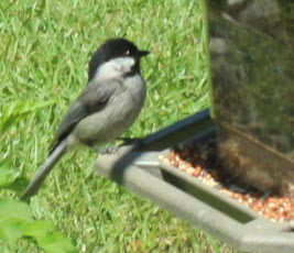
Black-Capped Chickadee

I loved catching the birds in motion. I know, blurry, but the motion is still very cool.

Male cardinal in motion
House Finch in motion

Tufted Titmouse in motion

Most of the southern squirrels we've seen are small and thin. The squirrels that hang out under this bird feeder are chubby squirrels like the ones we've seen up north. There are three very fat squirrels that eat the seed flung out of the bird feeder by the birds.

South Carolina Squirrel

Saturday, May 11, 2013

Artfully Meandering: Savory Sweet Potato Casserole

Living in the South, sweet potatoes and yams are in a lot of food. I love sweet potatoes. I am loving the current flavor rage of sweet and savory together. This sweet potato casserole recipe takes those lovely rustic vegetables and turns them into one spectacularly delicious meal. I'm currently obsessed with the flavor combinations in this recipe. 

Here was my casserole. It didn't even last a day. I'm making it again this weekend. The rosemary is that special final ingredient that takes this over the top. 


Thursday, May 9, 2013

Studio Time: Breaking the line drawing apart

Cheery Blossom 2 - Line Sketch

In my last post I mentioned that I like to scan in a line drawing .jpg and use Image Trace in Illustrator to take the lines apart into components. I very much like the look of hand-drawn versus a completely computer drawn image (although I will experiment with that later). Even though I'm using Adobe Ideas which helps vectorize the drawing, there is still enough of "me" in the drawing that reflects my hand. 

I started with Cheery Blossom 2 above. Below is the design colored in and taken apart component by component. I like using the pieces, the lines, what was originally negative space, even the tiny innards of the center and using them in various ways. I find all of these pieces help create a cohesiveness in the final design because it all relates to each other. It's a digital version of "nothing goes to waste." 

On the top are the components taken apart completely. On the bottom, there are various combinations of two of the components. I'm going to experiment with the pieces below to create some different designs and different color ways. 


Tuesday, May 7, 2013

Studio Time: Whimsical Butterfly in a Wildflower Garden

I'm trying to get some of my designs out onto my Pinterest board. I have some upcoming posts about my process of creating these designs. I'm super loving this set. 

This entire design starts with this line sketch. By breaking this line sketch apart, I created the following two designs. I'll explain the process in a series of Friday Design posts. 


I found a little graphic of words that I thought expressed my design style. I created this when I was brand new to surface pattern design last year and as I develop my style, I find all of these words still very true. The two designs in the remaining part of the post really epitomize what I feel is the essence of my current design sensibility.


I love rustic designs. The gingham in this design represents the country side of rustic that I love. Even though it looks like there are a number of different wildflowers in the sketchy part of the design, it really is just a breakdown of the same line drawing above, just separated and remixed as many ways as possible. The sun is also part of the flower and the rays are just a stretched petal. This wildflower mix turned out exactly as I hoped. Maybe even better. This is very much how I sketch in freehand and to be able to assemble it in Adobe Illustrator and have it look hand-sketched (just a little better) makes me really happy. I like that my digital work can reflect my hand drawn work.

The whimsical butterfly is a painstaking assembly of the leaves and stems in the wildflowers, just expanded and placed to look more butterfly-y (I know, not a real word). The dots on the butterfly are more of the same flowers. 


The neon version was a very cool happy accident. I was trying to create a black border on the white background and the background turned black. When I saw it, it looked neon and I loved it. I think I'm liking this neon version a little better.


Artfully Meandering: Crazy Daisies